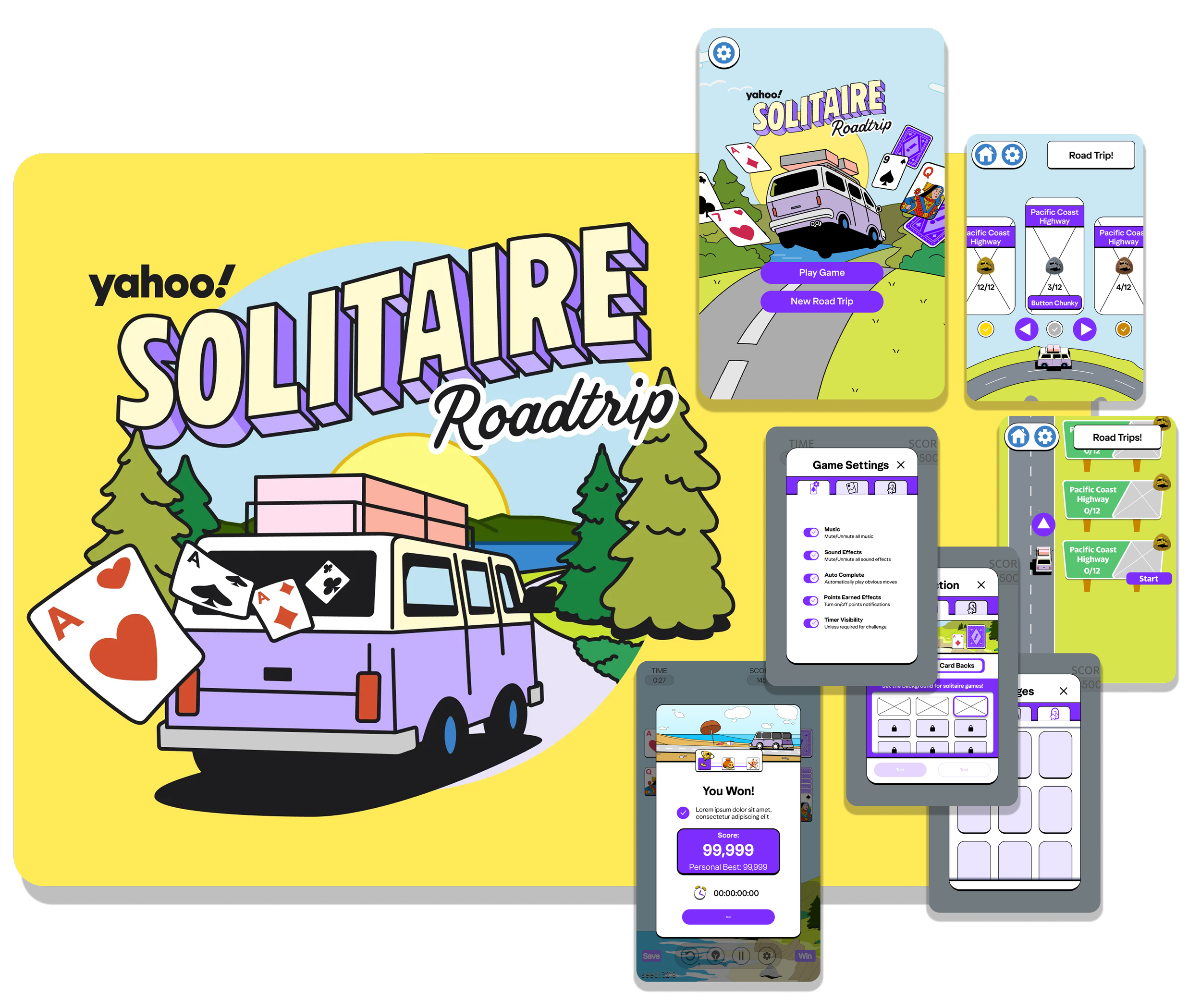
UI/UX for Yahoo Roadtrip Solitaire
Yahoo Road Trip Solitaire is a solitaire game made from the yahoo games team. Players take on challenges with the game of solitaire and progress through famous historical road trip routes across the USA. I had the privilege to work with them for a couple months building out the User experience and working within the game’s art style and the yahoo’s brand guidelines. This game was in development far before I joined the team and my time there was filled with effort made to refine the UX flow and create much of the UI. The following is a chronicle of work that I had a hand in designing.
Also, the shipped version has changes to these screens that are not here. After my involvement, things changed without my per view. I will only be talking about the versions of these screens I had a hand in making.

Teammates
There are many talented folks that contributed on this game but the main visual contributors were the following 2 artists.
If I didn’t do it, they did it, and I will call out exactly what I did in each section.
My Role and Duration
I was hired at the tail of development to design all of the UI/UX for all of the menu systems in the game in 3 months half time. (80 hours a month) Some elements were done prior to my arrival.
Tools and Methods
Tools: Figma & Photoshop
UX Design, UI Design, Prototyping, Animation planning
Limitations of Development
This game was made for an iframe that would be hosted on the yahoo games site. This means the size of the frame is a bit non standard and will be even smaller on a phone. With that in mind, the designs were always explored in mobile portrait first.
Mobile Portrait: 359×543
Desktop: 1008×616
Some designs were made for more screen ratios but engineers didn’t have time to support more of them.
The development environment also used both React and an engine called Canvas. Both of these had their own development challenges so, whenever design work would begin for something, I would always attempt to make the “best” version of something which React could handle perfectly. Compromises were made for Canvas.
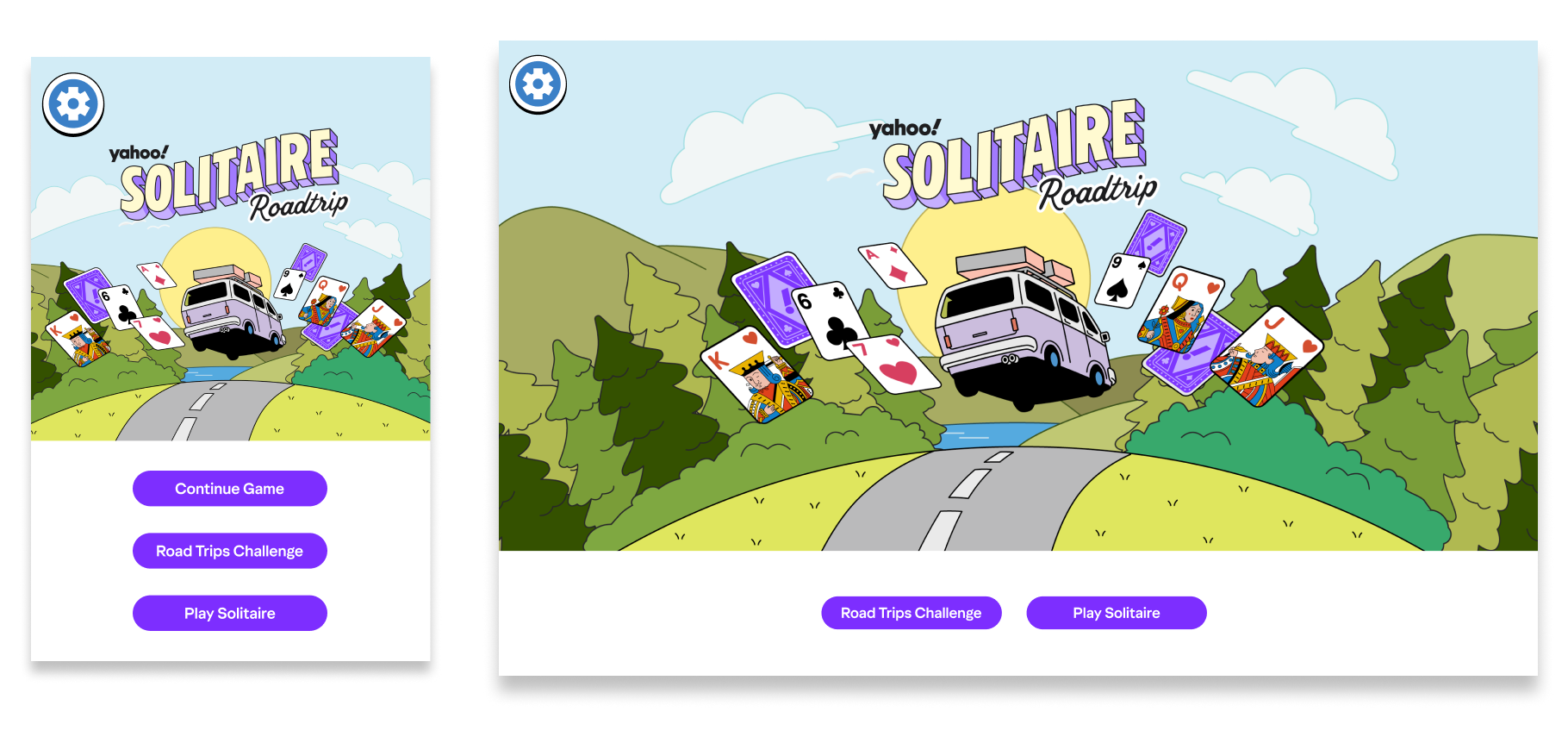
Main Menu
The Main Menu was initially made to accommodate 3 buttons. Two main buttons Road Trips challenge (the main focus of this game) and Play Solitaire. Continue Game button appears if the player started a solitaire game or challenge but did not finish it. Also, this established having settings on the top left of the screen for one other screen in the game so it would always be available no matter where they are in the game and it would always be in the same place.
Layout, button arrangement and styling were my contributions to this screen.
Level Selector (Backlog)
The following is a level selector that was never implemented or has not been implemented yet. The original flow of the game had the player flow through this level selector before moving on to each particular area / route of the road trip. Because this feature hasn’t been implemented, everything except the car is made by me without other artist help. Full prototype made and animated in Figma.
Option 1: Spinning World Level Selector
Interaction Method Arrows
Interaction Method Click Drag
Option 2: Straight Road Level Selector
Interaction Method Arrows
Interaction Method Click Drag
Roadtrip Challenge Menu
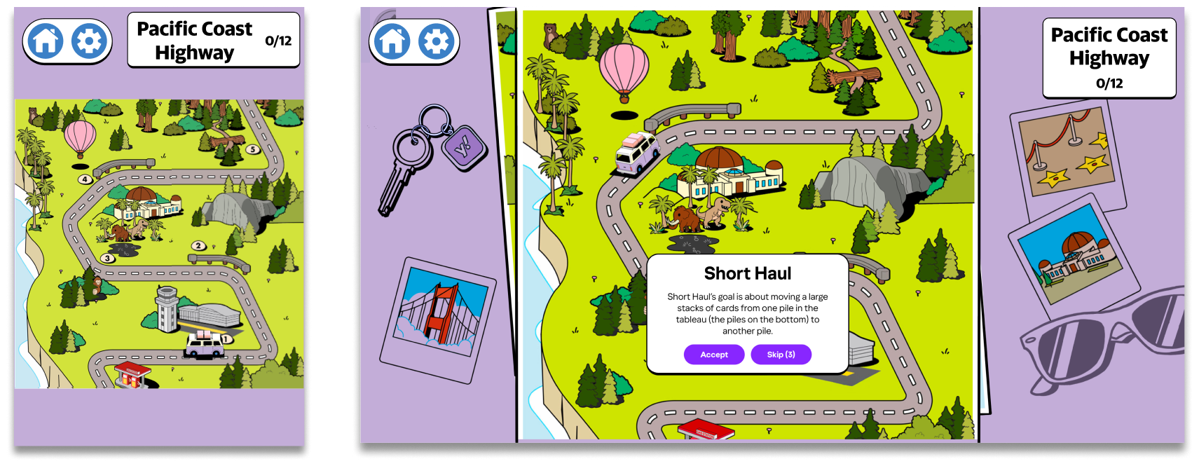
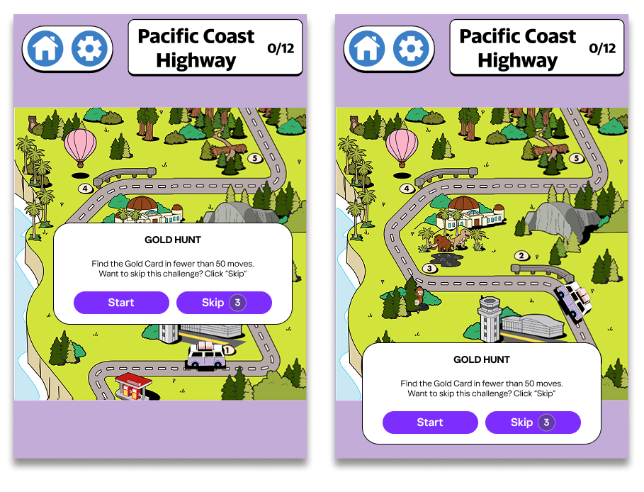
Messages will appear above and below the truck based on where the truck is on the screen. When there is room for a text box below the truck it should prioritize appearing below the truck so player can see the road ahead of them. These popups had a variety of states depending on their goals.
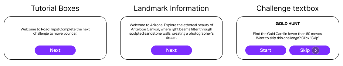
Tutorials and landmark information boxes always happen before challenge text boxes.
Challenge text boxes also have a “Skip” button with a counter that leads the player to an Skip Ad Modal Popup.
Road trip menu was designed near the end of development and there were quite a few limitations. The elements I designed were around how the messages were displayed when players went from one challenge to another. I also defined how settings, home and the title of the route shows on this screen on both screen sizes.
Settings
This settings menu was more than just for settings. The assignment had me combine a collection of background, card backs and badges along side a standard set of settings options.
My goal was to make each page of the settings house a different category of content.
Settings: All traditional Game Settings options
Customization: All forms of customization of the player’s background and the back of their cards could be adjusted and previewed here.
Achievement: A space where players could see all of the badges they have earned and either some facts about the badge or how they gained it.
Everything on these screens were done by me. Final version may have changed some assets after my involvement.
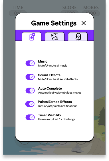
The game settings section houses classic settings, but some of these options are not immediately understandable. I added a subline to help improve understanding. Also most of these options would have a slider in other games but we only had access to On or Off states for these options.
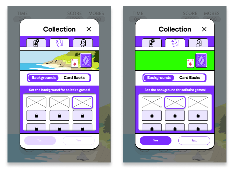
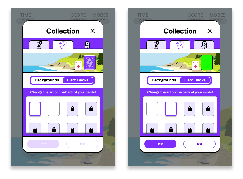
The customizations tab houses all of the players collectibles that could adjust their play experience. Specifically the player can change the background of their solitaire games and the backs of the cards they are using. I thought it was important for players to see the relationship between the backgrounds and the cards before they “applied” the changes, so I added a preview area the player could see the outcome of their change. The visualization of the Backgrounds and card backs toggle was a backlog design. The final version in game did not have the time to clean this up at the time of writing this case study.
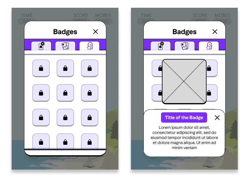
The achievement page was where the player could see all the badges they gained and how they got them. Originally I wanted to put more emphasis on the achievements. I wanted players to see why they gained a badge or allow the player to view what would it take for them to get certain badges for achievement hunting motivations. However, I was told to put more emphasis on the art and the achievements at the end of the day were more tied to progression than cool challenges so. A simple grid that you can click and get some more information is how we approached this.
End-Game Flare and Mid-Game Notifications
The end of game sequence they had prior to my involvement was very rushed and did not provide the play with the moment of joy that the player deserved. There was also a lot of nuance around conveying the reason the player won that was getting lost in the speed of it. There was also a lack of fun juicy interactions in the game so I wanted to add a bit of that juice to the end of a solitaire game.
At the end of a solitaire game, I pitched to add this banner that would move in, the text would appear to show how good of victory they got and then zoom away. (in this example platinum win appears)
In that same moment, where a signal would appear to show the player why they won that particular challenge. In the case where the Time, Score or Moves were the reason the player won a challenge a back plate would appear behind the transparent UI. In the case of a game mode that has to do with gold cards. a gold care would appear on screen. There were some conversations about changing the transparent UI that was present in the game before my involvement. If that UI had changed, I would have chosen a different answer for this signal.
We also wanted to find a way to convey notifications during the game. We borrowed from the execution of the big banner for a win, by making a smaller zoom in banner for notifications that would appear mid game. We wanted it to be fast and transparent to make sure the player is not stopped in the middle of their play.
End Game Reward Sequence
This reward sequence would appear after every game. After hearing all of the design requirements, I chose to try to separate every page into a different category of content to convey to the play.
The first page was for how well you did at this challenge or game of solitaire, showing your points and the completed challenge.
The second page was about paying out the experience or providing the player with their badges, cards or background based on their progress through the game.
The third page conveyed the player’s options for what to do next.
These screens changed quite a bit after I had left the project. These are the versions I presented when I pitched them to the team. If they changed the assets or how certain elements are presented. I was not involved.
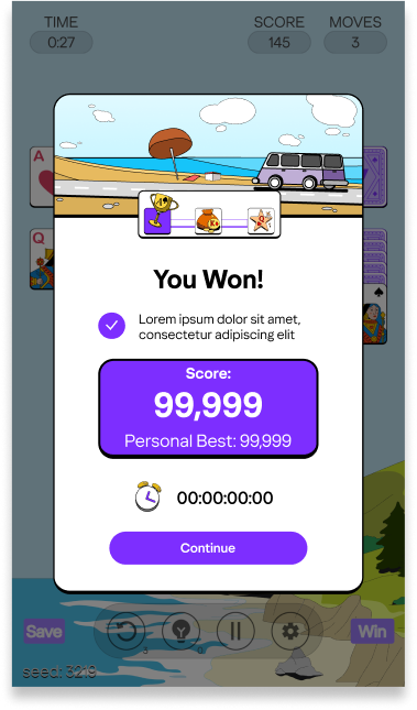
The first page of this experience presents your progress through the challenge. Players are also introduced to the progress tracker within the end game state. 1 of the progress trackers are the 3 milestone indicators in the top center. (trophy, bag of coins and Star) The other form of progress tracking is the car’s position. I believe the trophy, bag of coins and star may have been removed in the final version of this and only the car remains.
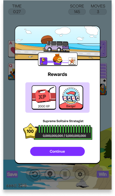
The second page shows the experience and any collectibles the player may have earned. Experience is fed into the meter near the bottom that ticks up. It also shows the player’s level and title. I had conveyed a possible problem, if they player doesn’t gain at least 1/20th of the goal toward a particular level, the experience bar may never tick up. We agreed that thematically it is a cooler result and mimics a older gas gauge of a car which was preferable for them.
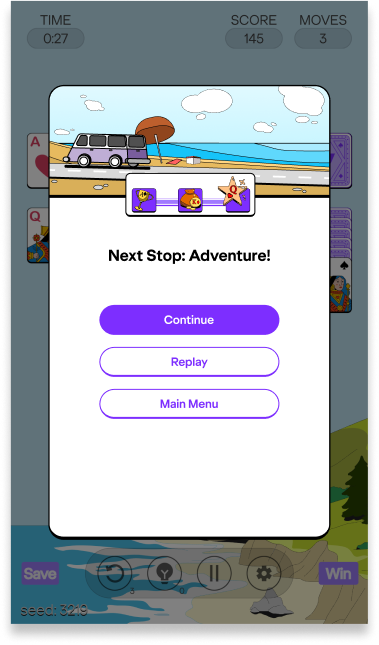
Third page was about what would happen next which housed the 3 buttons. A continue button which would take them wherever they need to go depending on what game mode they were currently in. A Replay button if they wanted to replay this particular challenge. Also a Main menu button so they could escape and start from the beginning of the game flow.
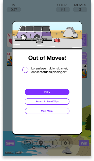
A version of this flow exists for when the player loses or does not complete a challenge. A solitary screen that just encourages them to try to complete the game or challenge again.
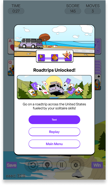
Another version of that third screen in the flow was also pitched to have a FTUE moment for certain content. Especially needed after the first game of solitaire. The player needs encouragement or instructions that the Road trip mode exists.
Hints, Undos, and Skips Ad Modal
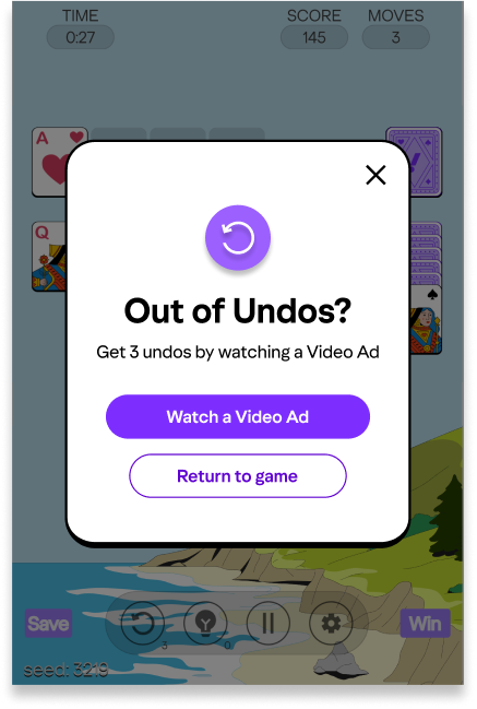
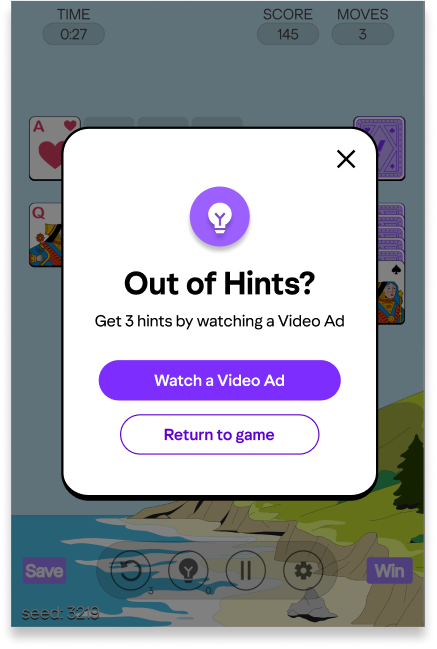
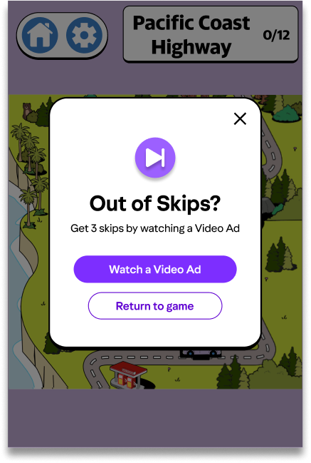
A video ad modal that pops up in a couple different scenarios when the player needs Hints, Undos and Skips. The game provides them with a base level of hints, Undos and Skips, then they can watch an ad to get more.
Hints and Undos have dedicated counters and buttons during solitaire games while Skips are used to skip challenges when players do not enjoy a certain type of challenge.